Photography Critique
| Photo Critique |
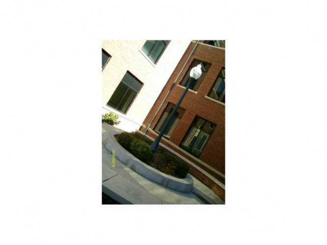
Title: Lamppost at Tarleton State
This is a picture of a lamppost in a Tarleton State University campus nook. There are several wrong elements occurring in this picture. First, the light is not consistent because I took this picture around noon. Also, the building casted an odd shadow around the lamppost making the landscaping very dark instead of giving the picture texture. The camera was not accurately focused even though it is a point-and-shoot digital camera. There are several good points about this picture such as its asymmetry, lines/curves, and purpose. I purposely turned the camera at a diagonal to give the picture a unique interest.
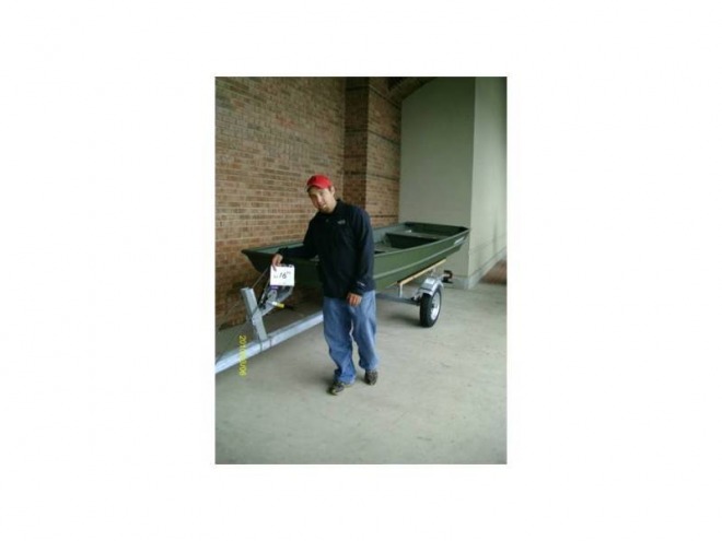
Title: Sticker Shock!
This is a picture of my fiance with his dream pond boat. The purpose of the picture is my fiance with the boat. It was a very dreary and rainy which contributed to bad lighting. Also, the boat was enclosed under a brick awning which would not let any light in anyway. There are no lines or curves due to the nature of the building. I created asymmetry by placing my fiance to the left of the frame while the right showcases the rest of the boat. Finally, there is human interest as the subject’s face is surprised by the price of the boat. This photo would have been better if I would have captured complete shock on my fiance's face along with better lighting.
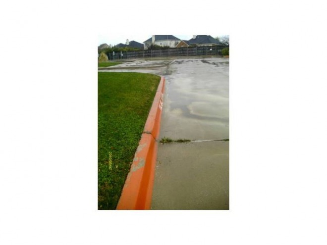
Title: Rainy Parking Lot
This is a picture of a church parking lot after a rain storm. The main purpose of this picture was to create lines and curves with the fire lane cement barrier. The lighting was not as bright as it should have been because it was a rainy day. There is no tension in this shot which makes the picture uninteresting. There is also no human interest which adds to the boringness of the photo. To make the photo better, I should have snapped the picture kneeling down to be more eye level with the lines and curves. Also, I would have taken this picture early in the morning or at evening to showcase the sunrise.
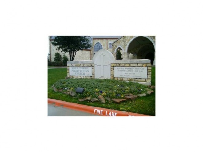
Title: Church Welcoming Sign
This is a picture of the Fort Worth Presbyterian Church’s welcome sign. Even though there is no human interest, the words on the sign develop curiosity. First, the fire lane cement barrier completely distracts from the purpose of the picture. The lighting is not bad for a dreary, rainy day. I created asymmetry by placing the sign towards the right of the shot. Ideally, I would eliminate the fire lane sign from the picture without eradicating the landscaping. Finally, I would want the doors of the church to be illuminated in the background which could probably be achieved by taking the picture in the early morning.
Reflection
The photography critique assignment seemed like a very easy task to complete. I was dead wrong. My photography capabilities are far from adequate which skewed my entire critique. I was very negative in my reflections. I procrastinated on the assignment and was forced to take pictures on a rainy day. To make matters worse, my camera had broken two days before the assignment due date, and I was borrowing a camera that was unfamiliar to me. I learned several important lessons from this assignment. First, never procrastinate with a project that requires technology or appropriate weather. Second, cameras do not have the ability to get wet or contend with sand invading the lens. Finally, always save your pictures because you never know when you will need them again.
